Loan Graph mortgage payment calculator
| Home page |
| Web App |
| Help |
| Support |
Help
The screen shots below go through the ways you can interact with 'Loan Graph'.
For a summary in words, scroll to the bottom.
In summary you can:
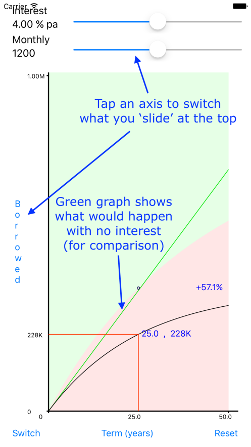
- Tap an axis label to 'switch' it with the top slider.
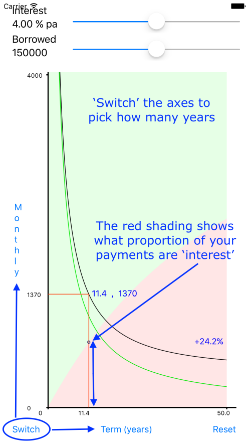
- Tap 'Switch' in the bottom left to swap the x-axis and y-axis.
- Drag the sliders at the top. When you let go, they re-centre so that you can reach other values in multiple slides. The slider is also more 'sensitive' in the middle so allows you to select values more carefully on a second slide.
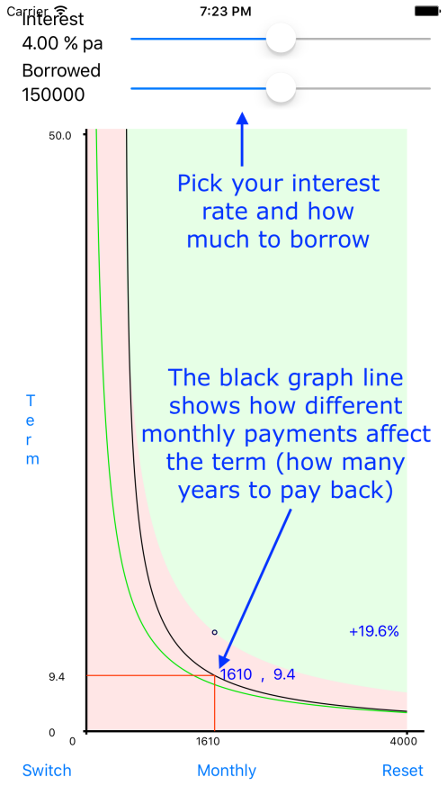
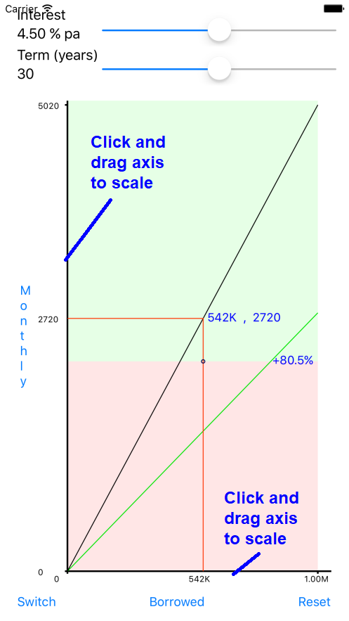
- Tap in the graph area to select a position on the x-axis to 'report' on.
- The black graph line shows the values calculated using the interest shown by the top slider.
- The green graph line shows values calculated with zero interest (to allow a comparison).
- The ratio of light red to light green shaded area on the graph shows the ratio of 'interst' payments to 'capital' payments over the course of the loan.
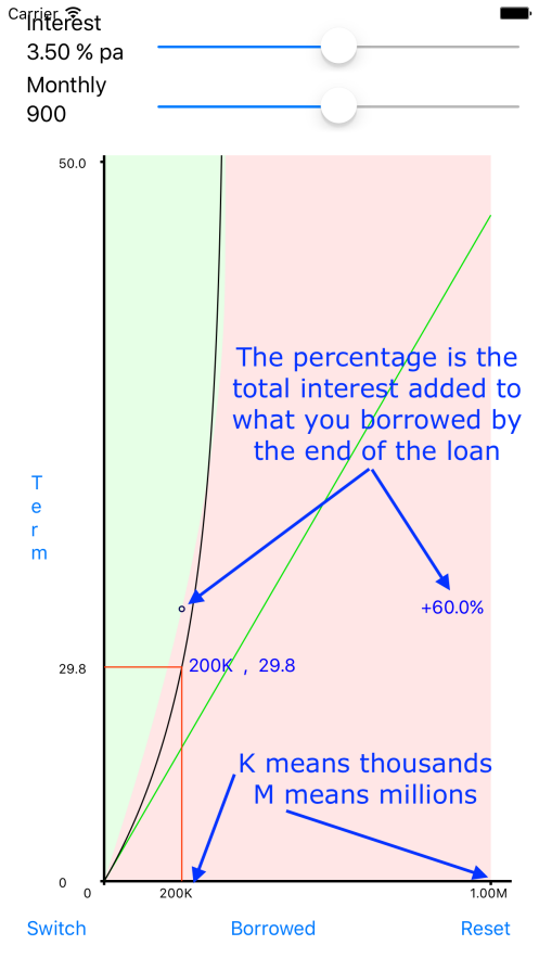
- The percentage and value on the right of the graph shows how much 'interest' is paid over the whole loan. The percentage is of the amount borrowed. This means if the red to green ratio is 1:1 (ie half-way up) you will have paid equal amounts of interest and capital payments. This will equate to 100% interest, because the interest added has been 100% of the original loan value.
- The reset button at the bottom-right sets everything back to default values. It clears all your sliders and graph stretches.
- Stretch the x-axis by clicking and dragging it left or right.
- Stretch the y-axis by clicking and dragging it up or down.
- K is for thousands. Eg 5K means 5000. M is for millions. Eg 3.5M means 3,500,000.